
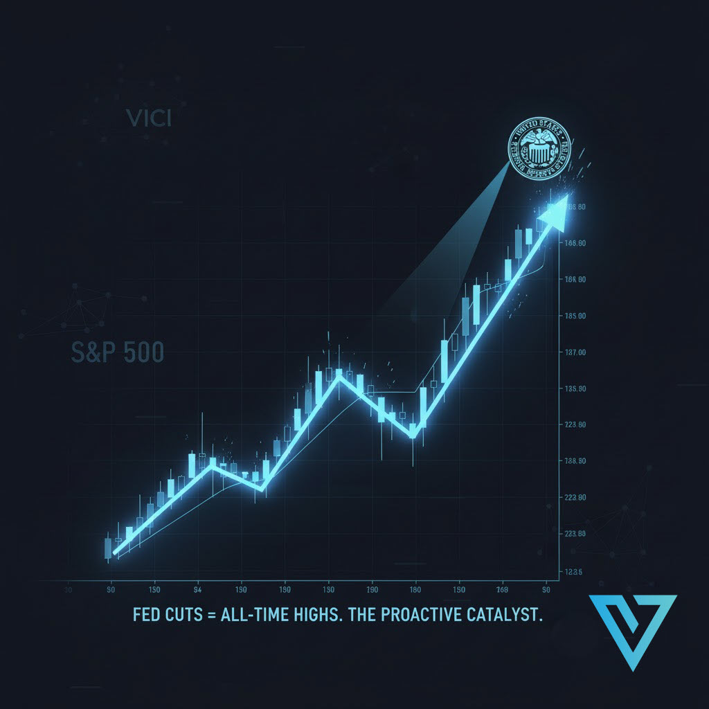
The Fed is Cutting Rates at All-Time Highs. Here’s What History Actually Says Happens Next.
A deep dive into the historical data, a famous market statistic, and what it really means for the S&P 500 one year later.

Hello Traders and Investors.
A question I get asked a lot—especially right now—is whether it’s bullish or bearish when the Federal Reserve starts cutting rates while the stock market is at or near all-time highs.
Intuitively, it feels a bit strange. Why would the Fed be cutting if everything is already booming?
I recently saw an tweet that captures the bull case perfectly. It claimed that in the four times this had happened before 2019, the S&P 500 was higher every single time one year later, with an average gain of +20%.
I’ve never been one to trust market “memes” without a full data check. So, I did a deep dive to fact-check the numbers and see what the full story is.
Here’s what I found.
Fact-Checking the “Famous Four” Cuts
The statistic in that tweet, which was originally from 2019, was referencing four key “proactive” rate-cutting cycles that began near market highs. And here’s the deal: the tweet was actually correct at the time.
Here are the four instances it was likely referencing and the S&P 500’s performance one year after the first cut of that new cycle:
1984: S&P 500 was up +24.1% one year later.
1989: S&P 500 was up +15.7% one year later.
1995: S&P 500 was up +20.9% one year later.
1998: S&P 500 was up +21.8% one year later.
If you do the math, the average of those four returns is +20.6%. The “100% win rate” and the “+20% average” claims both hold up.
The Critical Caveat: What Happened on the “Fifth Time”?
Here’s the catch, and it’s a big one. That tweet was forecasting what would happen after the July 31, 2019 rate cut—which was the “fifth time” this scenario occurred.
So, what happened one year later, by July 31, 2020?
The S&P 500 was up only about +9.8%. More importantly, in the middle of that 12-month period, the market was hit by a “black swan” event—the COVID-19 pandemic—which caused a crash of over 30%.
This is the most important lesson for any trader: Historical statistics are fantastic for context, but they are not a guarantee. A real-world event can, and will, disrupt even the most perfect-looking pattern.
Don’t Trust a Tweet—Trust the Broader Data
That tweet’s sample size of four is tiny. So what happens when we look at all the data? The story remains overwhelmingly bullish, just with more realistic numbers.
I dug into some larger studies from firms like LPL Financial and Citi, and here’s what they found:
LPL Study (since 1984): Looked at 28 instances where the Fed cut rates when the S&P 500 was within 3% of an all-time high.
12-Month Win Rate: 93% of the time, the market was positive.
12-Month Average Gain: +13.0%
Citi Study (since 1980): Looked at 13 instances where the Fed cut rates within 1% of an all-time high.
12-Month Win Rate: 100% of the time, the market was positive.
12-Month Average Gain: +14.7%
As you can see, the broader data confirms the bullish premise. Even our most recent example, the September 2024 rate cut, saw the S&P 500 rally roughly +17.5% over the following year.
My Takeaway: It’s All About “Why”
The data is clear: Fed cuts near all-time highs are historically bullish.
The real question isn’t if they cut, but why they cut. The historical data can be split into two very different scenarios:
Reactive Cuts (BEARISH): This is when the Fed is cutting rates because something is already broken and they are panicking to save the economy (e.g., 2001 dot-com bust, 2007 financial crisis). In these cases, the market falls despite the cuts.
Proactive Cuts (BULLISH): This is when the Fed is cutting rates as a “soft landing” adjustment because inflation is under control and they want to keep the economic expansion going (e.g., 1995, 1998).
The cuts we are seeing now, much like the ones in 1995, 1998, and 2019, are proactive. The Fed is not trying to fix a broken market; it’s trying to keep a strong market going. Barring another “black swan” event, history shows this is an incredibly positive environment for equities.
Until next time—trade smart, stay prepared, and together we will conquer these markets!
Ryan Bailey, VICI Trading Solutions.
This is exactly the kind of historical context traders miss when they rely on viral charts without asking why the Fed is cutting. The market’s reaction has never been about the act of easing itself. 1995 and 1998 were “insurance” cuts during expansion. 2001 and 2007 were emergency brakes in freefall. Right now, the setup still looks like the former: disinflation + resilient growth + policy normalization, not panic. Great article!
Thanks so much. I appreciate the context and I'm really happy you enjoyed it. Thanks for the kind words.