
How We Use Gamma Exposure (GEX) Levels to Sharpen Our Edge Every Single Day
Our proprietary options data gives us a window into where dealers are positioned—and why that matters for your next trade.

You’ve probably seen them by now—those colorful bars on the chart that show up in every daily trade plan I publish. Put walls on the left, call walls on the right, sometimes a pivot in the middle, and that curved line at the bottom that looks like it belongs in a physics textbook.
And if you’re being honest with yourself, you might have glanced at them, nodded, and moved on.
I get it. Options data can feel like an entirely different language. And if you’ve ever tried using another service’s gamma exposure levels, you know exactly what I’m talking about—twenty-plus levels crammed onto a single chart, no hierarchy, no context, and absolutely no clarity on which ones actually matter. I’ve been through them all. Every one of them left me asking the same question: How do I know which levels are important and which ones are just noise?
That frustration is exactly why we built our own.
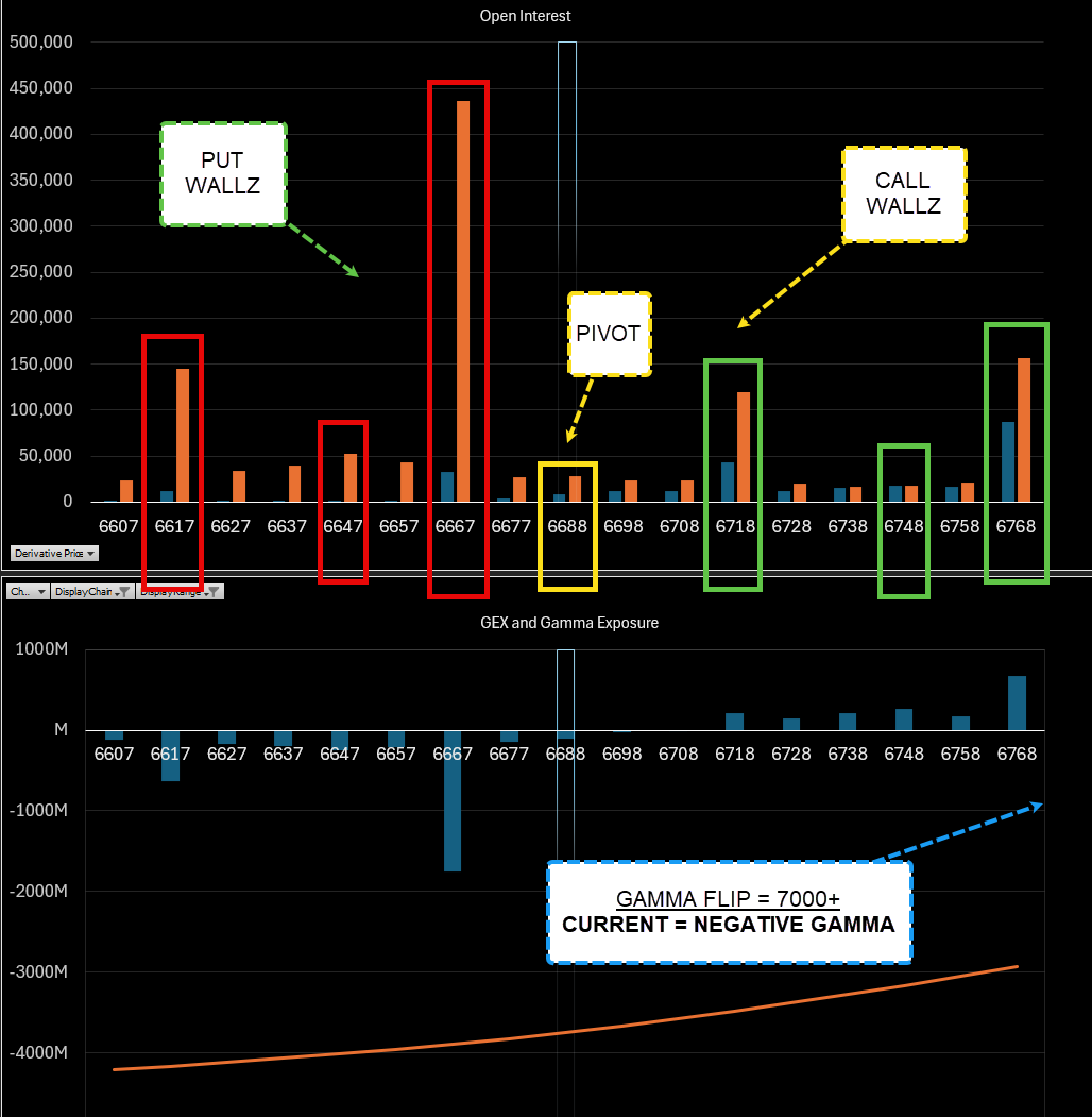
What You’re Looking At: The S&P Edge Options GEX Levels
The GEX levels you see in every daily trade plan are proprietary calculations done in-house by us. These are not pulled from a third-party feed and slapped onto a chart. We have spent significant time organizing, filtering, and prioritizing options data to surface only the levels that we believe have the highest probability of producing a reaction.
This is a critical distinction. Where other services give you a barrage of twenty-plus levels and leave you to figure it out, we hand-select between two and four levels on both the call side and the put side. That’s it. Three call walls, three put walls, and when the data supports it, a pivot in the middle. Quality over quantity. Precision over noise.
Here’s how to read what you see on the chart:
The Put Walls (Red) — These are strike prices on the downside where we’ve identified the largest concentrations of open interest combined with significant gamma volatility exposure. Think of these as floors that dealers may defend. They sit below the current price and represent levels where downside momentum could stall or reverse.
The Call Walls (Green) — The mirror image on the upside. These are strike prices above the current price where heavy call open interest and gamma exposure converge. They act as potential ceilings—levels where upside momentum could meet resistance as dealers hedge their positions.
The Options Pivot (Yellow) — When the data supports it, we’ll mark a pivot level. This is an options level where we believe price will continue its progression above or below based on our calculations. Not every day produces a clean pivot, and when the data is unclear, we simply don’t force one. If you don’t see a pivot on a given day, don’t worry about it—it just means the data wasn’t definitive enough to warrant one.
How We Actually Use These Levels (And How You Should Too)
This is the part that matters most, so let me be absolutely clear: We do not trade these gamma exposure levels independently. Period.
These strike prices are not entry signals. They are not standalone setups. You do not see a put wall and blindly go long. That is not how this works.
The way we use these levels is as a layer of confluence. If we already have an untested structure or a significant level from our daily process, and a large call wall or put wall lines up directly with that level—now we’re talking. That’s when the GEX data becomes incredibly powerful. It’s telling us that not only do we have a historically significant level, but the options market makers are positioned to defend that same area.
Think of it like this: you already have a high-probability level based on your structure and process. The GEX data is a second opinion from an entirely different data set—the options market—confirming that your level has teeth. When multiple layers of information converge on the same price, the probability of a reaction goes up significantly.
An untested level with the confluence of a very large call or put wall? That’s when the level becomes the most important. It’s simply about stacking the deck in your favor.
The Gamma Exposure Line: Understanding Your Environment
At the bottom of the chart, you’ll notice a curved line. This is the gamma exposure line, and it tells us something absolutely critical about the kind of day we can expect: whether we’re in a negative gamma regime or a positive gamma regime.
Understanding this distinction fundamentally changes how you approach the session.
Negative Gamma Territory — When the gamma exposure line indicates we are in negative gamma, it means dealers are hedging to the short side. This is where things get volatile—and for traders, that’s a gift. In negative gamma, expect range expansion, larger-than-normal moves, and the very real possibility of short squeezes. Money can be made in both directions, and longs can absolutely see follow-through. However, you have to expect the unexpected. The market can whip violently. If you’re not prepared for that, you will get caught off guard.
Positive Gamma Territory — The opposite environment. When we’re in positive gamma, dealers are hedging to the long side. The market tends to grind higher in a controlled, contained fashion. Ranges are tighter, moves are smaller, and the path of least resistance is up. If you’re in positive gamma territory, you want to be leaning long. Any shorts you take should be treated as scalps only—short-lived by design. Dealers are hedging to the upside, so you’re effectively in “buy the dip” territory.
The gamma flip level is noted on the chart as well. In the example above, the gamma flip sits at approximately 7,000—and with the market below that level, we’re firmly in negative gamma. That tells us before the session even begins to expect elevated volatility and to plan accordingly.
Why This Matters for Your Daily Process
Let me connect all of this back to the big picture. Every single day, the trade plan you receive from the S&P Edge is designed to give you the most comprehensive, multi-layered view of the market possible. The GEX levels are one piece of that puzzle—but they’re a powerful piece.
They give us an eye into the market mechanics of where dealers are positioned. We already know we have highly reactionary, highly probable levels from our structure work. When we add GEX confluence on top of that, it gives us every reason to believe we can get the reaction we’re looking for.
This is one more way we use tools to sharpen our edge. It does not become a process replacement. It becomes a complement and a component of our process as we look for multiple layers of confluence and highly probable reactionary zones.
How to Put This Into Practice
The next time you open the daily trade plan, here’s exactly how to use the GEX chart:
First, check the gamma exposure line at the bottom. Are we in negative or positive gamma? This immediately frames your expectations for volatility, range, and directional bias for the session.
Second, identify the call walls and put walls. Don’t just note the levels—cross-reference them against the key structure levels in your trade plan. Where do they overlap? Those areas of overlap are your highest-conviction zones.
Third, if a pivot is present, note it. This is the level where we believe directional progression will continue. It serves as a dividing line for your session bias.
Fourth, and most importantly—do not trade these levels in isolation. They are context. They are confluence. They are one more reason to trust a level you were already watching. Nothing more, nothing less.
This is how professionals use options data—not as a crystal ball, but as one more edge layered on top of a process that already works.
Until next time—trade smart, stay prepared, and together we will conquer these markets!
Ryan Bailey, VICI Trading Solutions.